Here are the two examples of my flat plan pages for the cover of my school magazine and the contents page. I have tried to use the recognisable, stereotypical template of usual magazine covers, for example, the masthead will be positioned at the top of the page and will dominate the page, along with the main image. I have designed my flat plans in this particular way so that it matches the codes and conventions needed to create a successful media product.


I have also included on this page some screenshots of the images I used to create my cover and contents page using Photoshop, along with the processes I made to edit and adapt certain images or graphics.
1. I began by creating the background which would be most appropriate to use for the front cover of the magazine, therefore I chose to use a gradient tool on Photoshop, as it is much more pleasant and appealing to the eye, compared to using one solid colour. I also liked the option of using a gradient background because the white at the top allowed my masthead to stand out from the page even more.

2. I then selected the image which I would use as the main image. I chose this particular image because it would be easy to create co existing headlines around the cover page, without having it look too busy or overcrowded. Therefore I added the image to a separate layer on Photoshop and began cutting out the excess white background away from the image.

3. I then decided to adjust the contrast and brightness of the image to make it a tiny bit darker, because it was originally too bright and was clashing with the background. By editing the image, it became more pleasant to the eye,

4. After inserting images, I then began to create some new layers for my text and additional graphics. This meant that I was able to create the masthead for my magazine cover and a slogan. Then I continued to add more graphics on the page, such as a red star, which I created to be a pug.
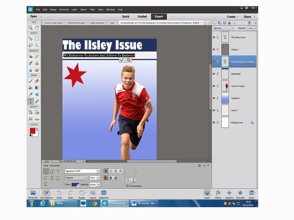
5. Finally, I continued to create new layers for everything else that I wanted to add onto my cover page. I included more graphics such as an arrow, kept the house style of appropriate colours, kept a consistent font and enlarged it or minimised it in relevant places and added the school logo onto the page.

Additionally, I chose the following images to be on my cover and contents page because I felt that they were enticing for the audience and they were easy to match with the anchorage text and strap lines which I used on the cover, and the other images match the articles on the contents page.
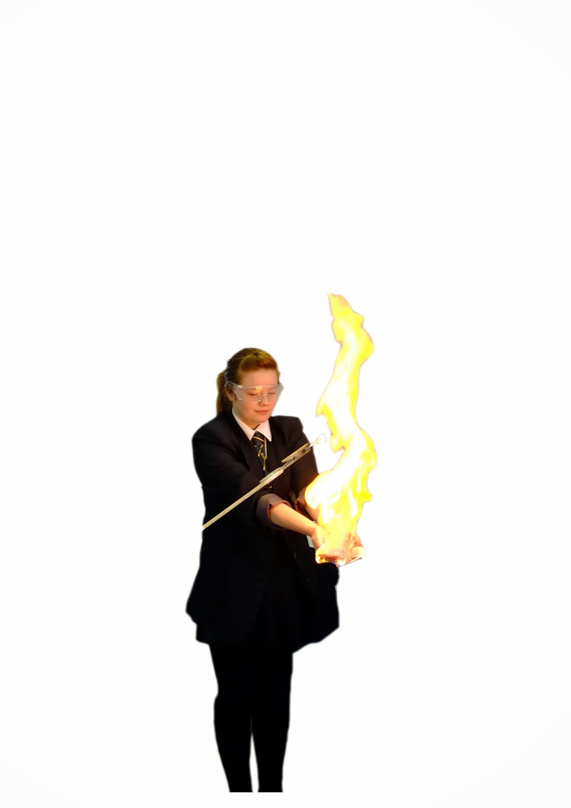
I used the image of the girl holding the fire because I thought that it would attract the attention of the audience straight away and it was also an appropriate image to use alongside the headline which was about the science department in school. However I thought that the second image had a brighter flame, so I adjusted the contrast on Photoshop in order to make the flame stand out more.


This image was clear and bright, however I chose not to use it as I did not include a subtitle on anything to do with music, therefore it would have no relevance,

Finally, I chose this image because I thought that the positioning of his body would be perfect for writing headlines around. Also I liked the way this image had a direct mode of address by keeping eye contact. Also, the PE uniform that the student is wearing matches the house style which I have chosen.

The logo's of Facebook, Twitter and Blogger were also included on my cover as it applies to the usual codes and conventions of having convergent links on the magazine cover. This means that the target audience would be able to gain additional information online.

This is my final design of my school magazine cover which I created on Photoshop.
I think that I have done reasonably well and I have tried to maintain the necessary codes and conventions needed to produce a successful magazine cover. However, to be critical of my own work, I think that this cover could be improved by making the main image bigger clearer. I also think that the layout of the coexisting headlines could be improved so that it does not look as busy/messy on the page.

This is a printscreen of the contents page which I created on Photoshop.

After looking again at the contents page which I created on Photoshop, I decided that some improvements could be made. For example, instead of using the same image of the young girl holding fire, I chose to delete one of the images and change it to a different image of Twitter, Facebook and Blogger logos, which is an improvement as it will attract a wider range of audience and even promotes technological convergence. I also chose to zoom in on the photo of the girl and crop the image so that a close up shot is used on my contents page.

No comments:
Post a Comment